Simplifying the remote control experience for support technicians
Product Design | 7 min read
Overview
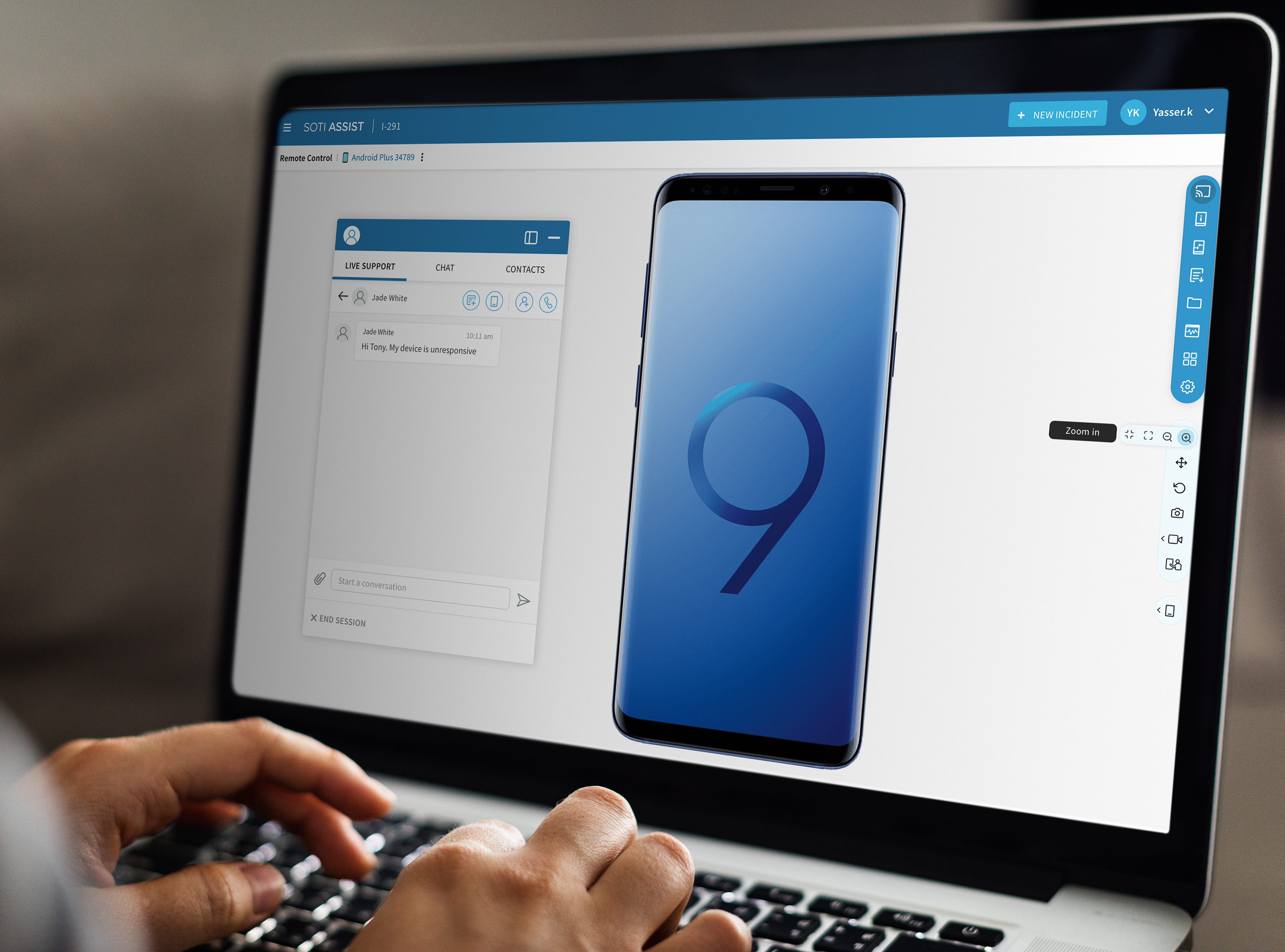
SOTI Assist was a support system mainly used by technicians to help users resolve device issues. However, the product had a limited customer base due to its poor user experience and restricted functionality.
The Challenge
I was tasked with redesigning a unique feature for a product being used by IT administrators and support technicians. This support system product was created to help companies that relied on mobile devices for almost every major task of their daily work, to reduce the downtime of the devices. The unique business idea behind the solution was to provide remote control of the mobile devices for troubleshooting and training purposes. My initial task was redesigning the remote control feature to improve the user experience and eventually improve the overall experience for the product which included a support dashboard and ticketing system.
The Problem
The issue was that the solution was inefficient, slow, and difficult to navigate. The product was initially developed by a team of engineers who included many features, but none of those were intuitive or user-friendly. My objective was to create a user-centric, fast, and efficient workspace that would streamline the experience for support technicians.
The Original Design
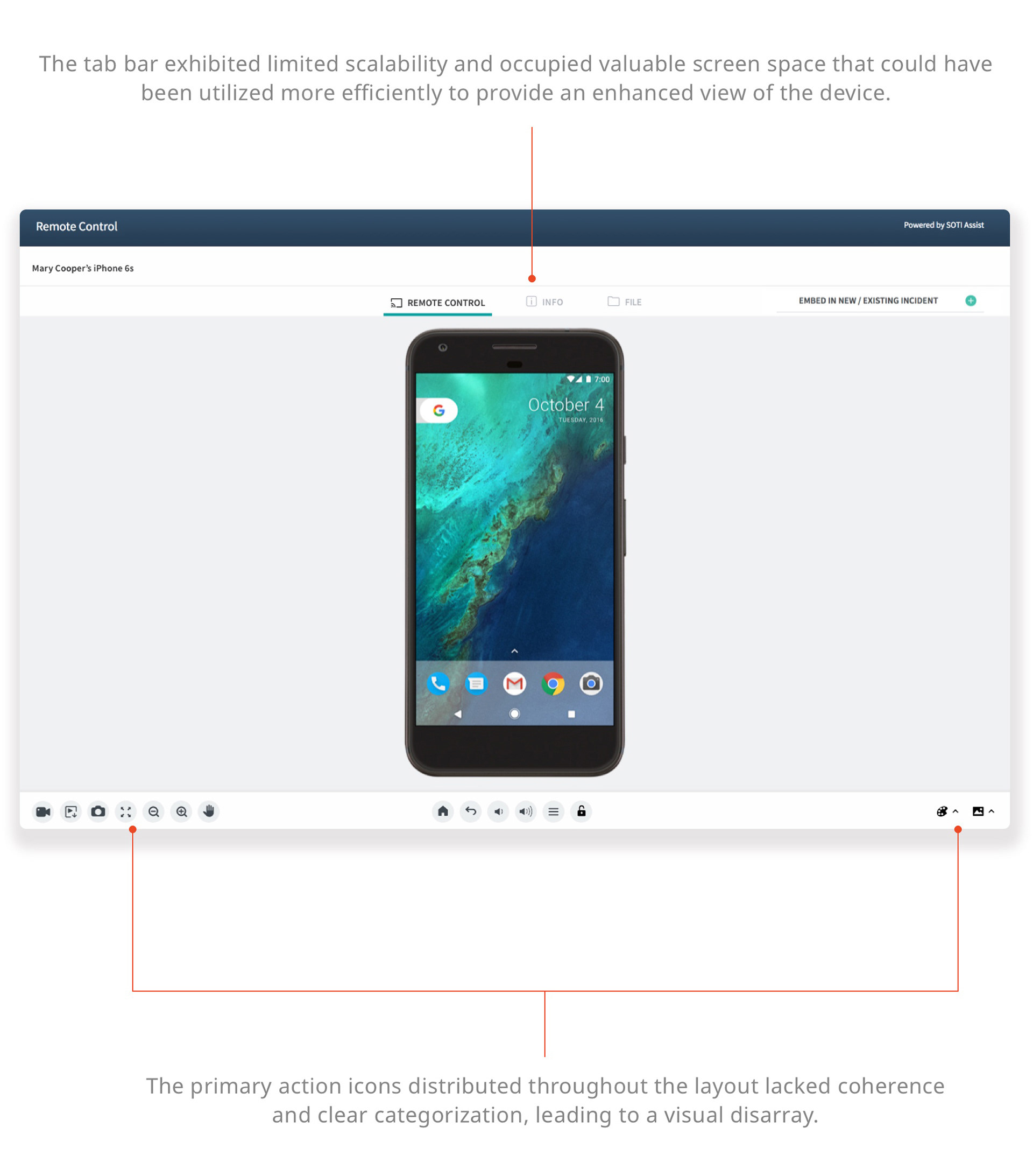
The customers expressed their concern about scalability. The current layout proved inadequate for accommodating multiple screen sizes or a collapsed version, a crucial requirement for the support system solution.
The Journey from Problem to Solution
Research and Discovery
I kicked off the project by gaining a deep understanding of the product, conducting extensive user interviews, performing task analysis, and scrutinizing the competitive landscape. These insights allowed me to identify the primary pain points and areas of improvement.
Understanding the Product
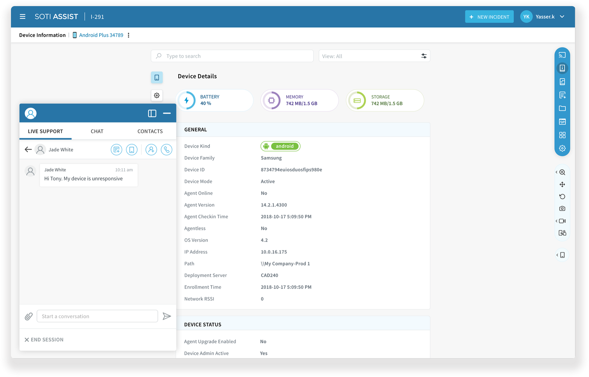
I studied the legacy product, the original version that was created a long time ago and found out that remote Control is a unique feature for support technicians to quickly troubleshoot a device from anywhere. Whether the device is within proximity or out in the field, a technician can do multiple things to solve device-related issues which includes looking into the device’s status, exploring files, ending a process, recording a video of the steps to resolve the issue and sending it to the user etc.
Understanding the User
The primary users of this feature were Support Technicians who would use this feature extensively to resolve device issues. While conducting research about the users I interviewed a few customers and created a user persona based on my findings.
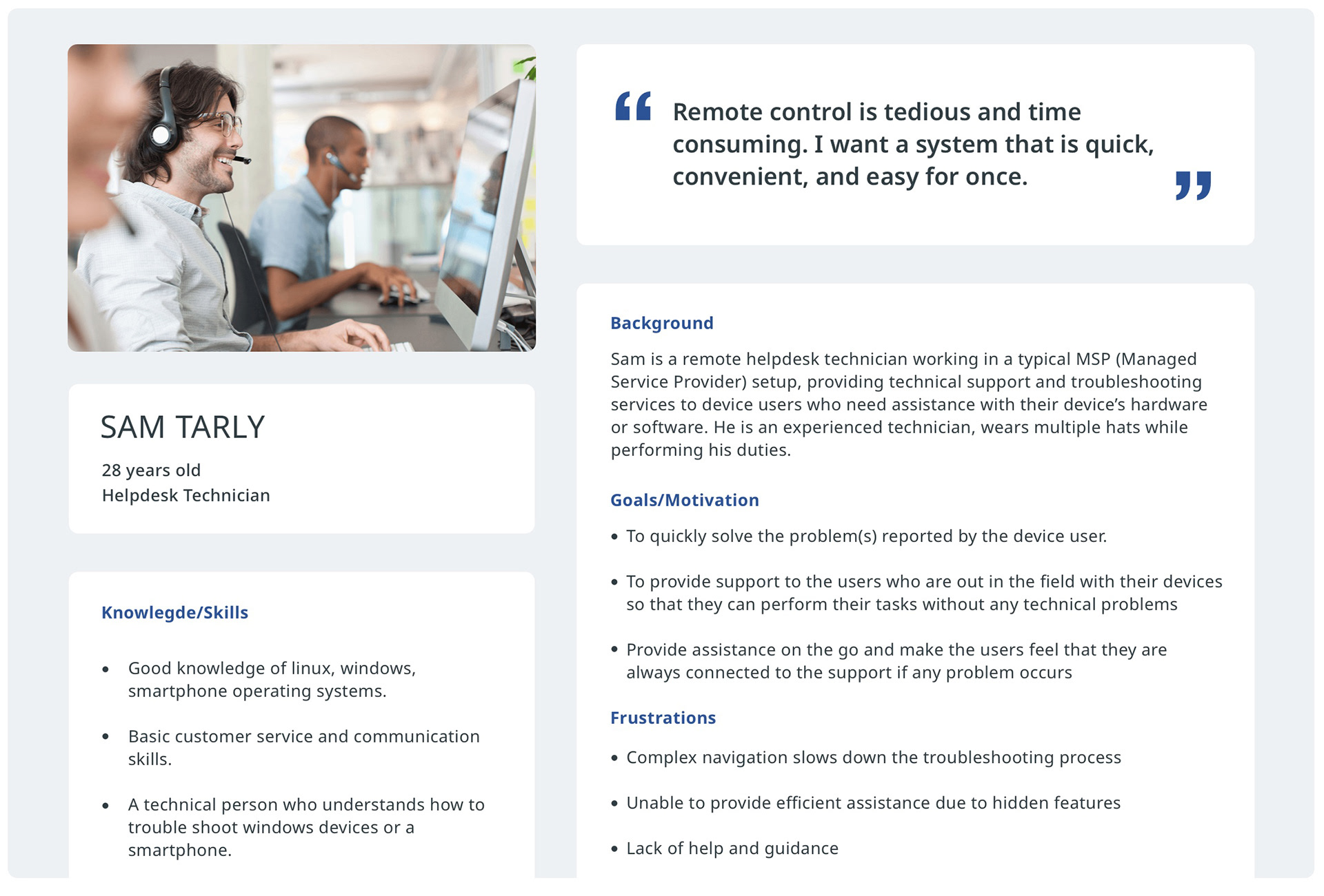
Working on the persona helped me to understand the user from a detailed perspective. As Remote Control was mostly used by technicians, I did some research on their work routine and what pain points they have from the existing solution. Interviewing customers and stakeholders who interact with customers often, helped to gather the most common pain points:
- Complex navigation
- Unclear controls
- Hidden functions and requirements
- Lack of help and guidance
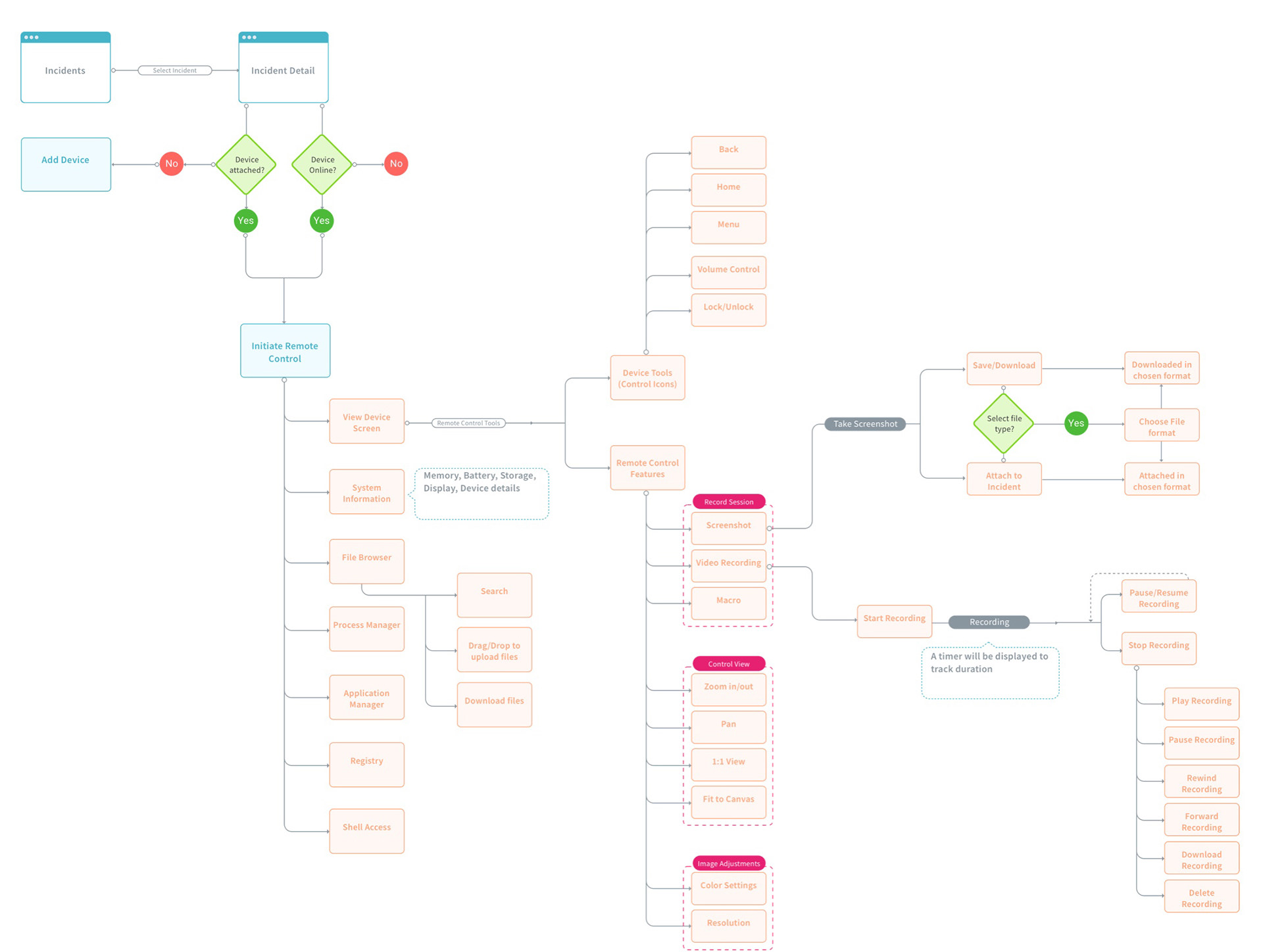
The User Flow
After evaluating the features and user requirements, I created a flow to address the complex navigation issue and simplified the user journey.
Competitive Analysis
During my research, I found another popular support management solution - AetherPal, very similar to the product I was working on and discovered some interesting points that could be taken into consideration for a better solution.
AetherPal had organized common functions together but the user interface was not consistent. It was also not easy for the user to get familiar with the product quickly.
Evaluating the competition allowed me to think around the lines of ease of navigation and grouping together the most common functions, to save time for support technicians.
I explored the product and found out relevant information that could be broken down into pros and cons:
PROS
- Grouping similar information
CONS
- Non-Intuitive
- Negative empty space
- Scattered visual elements
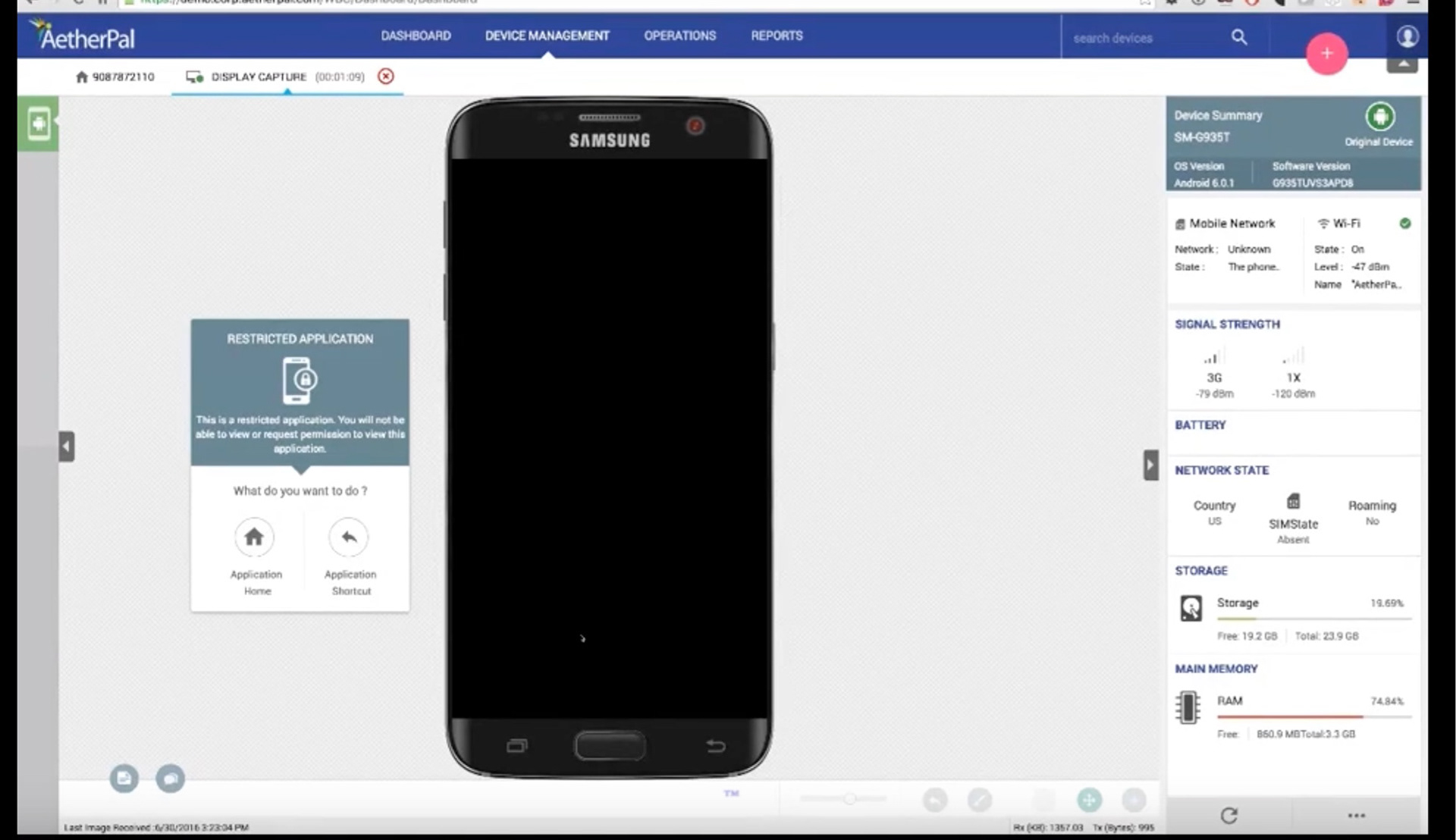
A screenshot from Aetherpal
Ideation and Prototyping
Armed with my research findings, I developed multiple wireframes, and user flows, eventually narrowing down my options to three distinct concepts. I created interactive prototypes and tested them with users to gather valuable feedback and refine my designs.
Whiteboarding
I initiated the ideation phase by scribbling my ideas gathered from the research and findings on the whiteboard. This is the best way to brainstorm the initial thoughts. Keeping in mind the product requirements and user’s pain points I tried different ideas. - Write what you gained from it.
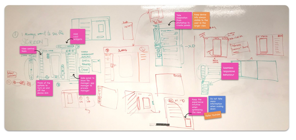
The most significant challenge I encountered was the intense involvement of internal stakeholders, who expressed considerable dissatisfaction with the existing user experience. Their preconceived ideas heavily influenced the initial brainstorming sessions, adding a layer of complexity to the design process.
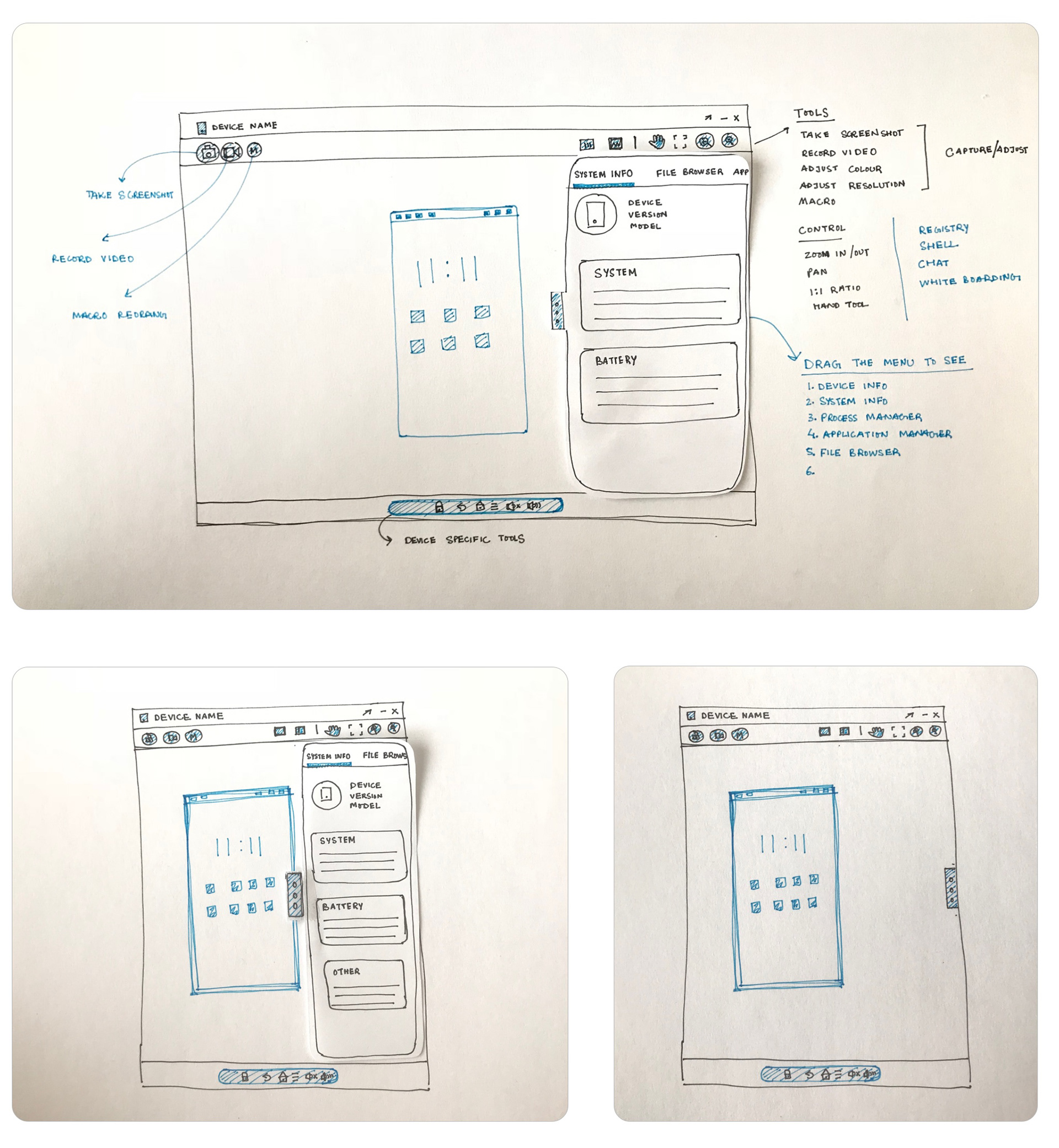
Initial Sketches
I narrowed down my ideas to 3 different concepts and created initial wireframes that were focused on innovating a clean and simple workspace for support technicians which would help them to resolve device issues quickly.
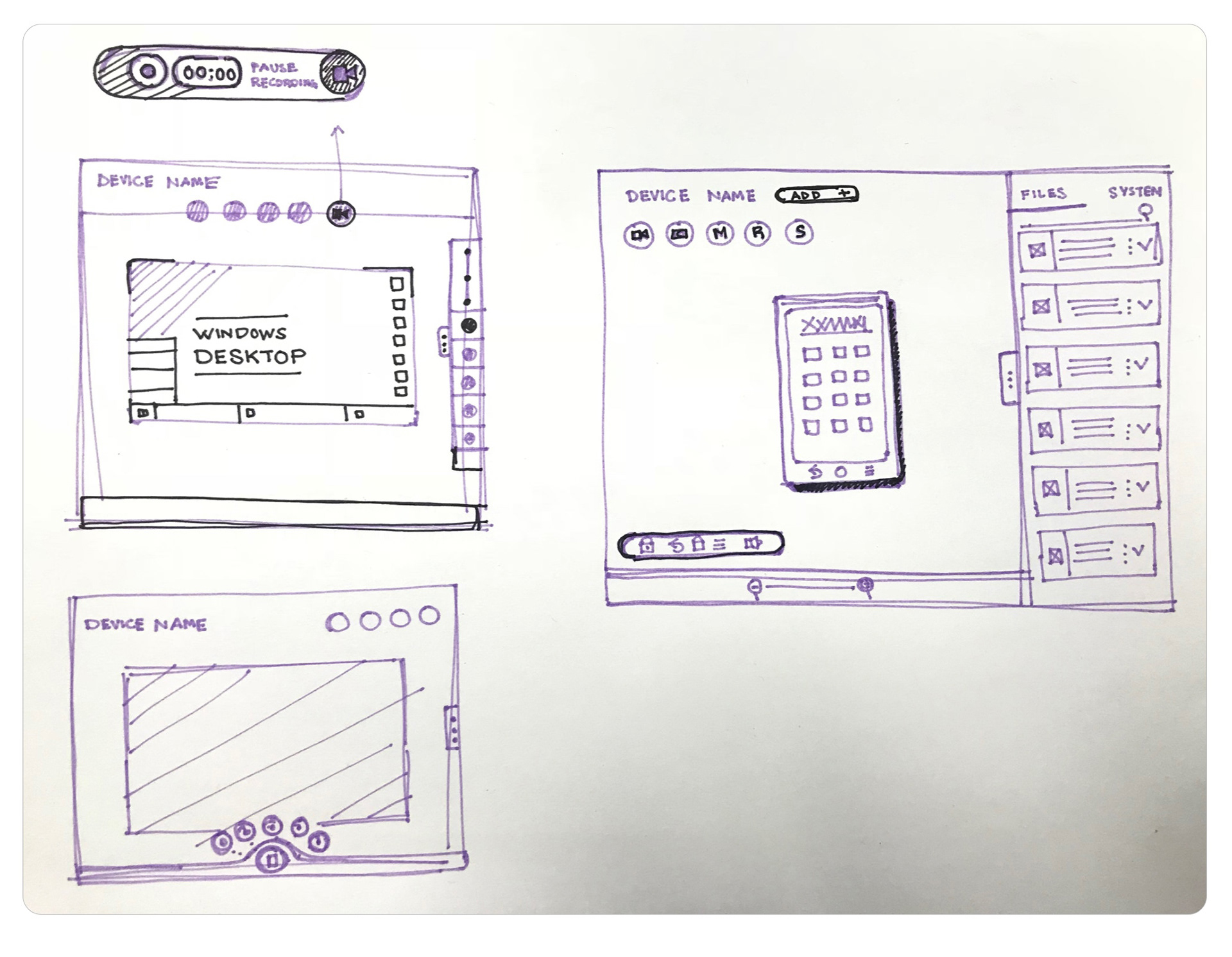
While working on the solution I identified three main sections for the workspace that required quick and easy access
Device specific actions
Home, back, lock/unlock, menu
Recording activities
Take screenshots, record videos, and screen recording
Controlling the view
Zoom in/out, pan, full-screen view
Throughout the Ideation phase, I kept in mind the responsive aspect of the design. Designing for different screen sizes was one of the biggest challenges that I came across while working on the product.
Mid-Fidelity Wireframes
A Mid-fidelity prototype was created in invision for internal usability testing. I opted to go with a mid-fidelity version of wireframes for usability testing before moving towards the final solution. This was an opportunity to test the improvements that I created for the product which addressed the major issues related to speed, navigation and scalability.
Takeaways
I tested the wireframes with customers and found interesting results.
- Most of them liked the idea of categorization but preffered all actions more closer to the tool bar on the right.
- It was learnt that a device screen may not be always required in the view while they are looking into files or other device-related information.
Working on the mid-fidelity wireframes and conducting thorough testing prior to finalizing the solution provided me with invaluable insights into user needs. This process served as a catalyst for the innovative design of a toolbar, fundamentally transforming the user experience with the product.
Beyond this, it unlocked avenues to explore additional solutions that had not been previously considered.
Building for Coherence
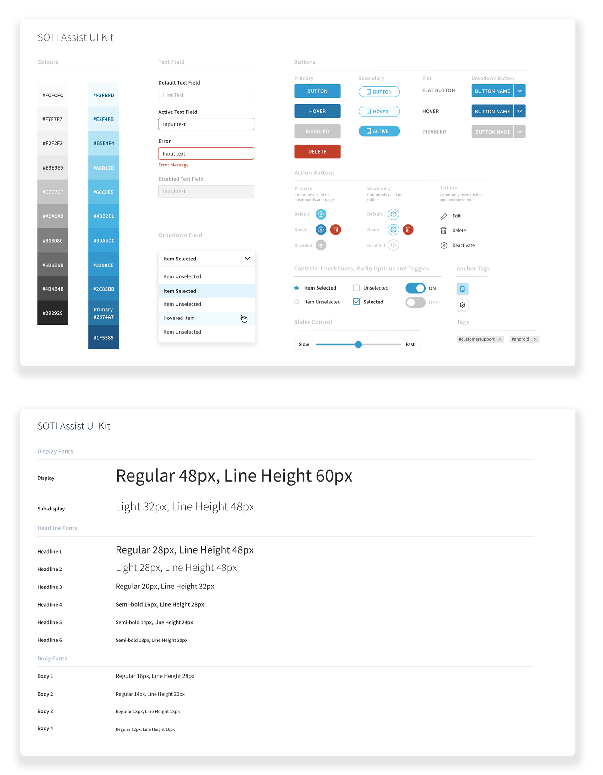
Before finalizing the high-fidelity layout, my initial priority was the creation of a UI Kit to expedite the design process. Establishing a solid foundation for visual design, I systematically added components while redesigning the remaining sections. This approach ensured consistency and efficiency throughout the entire design and development phase.
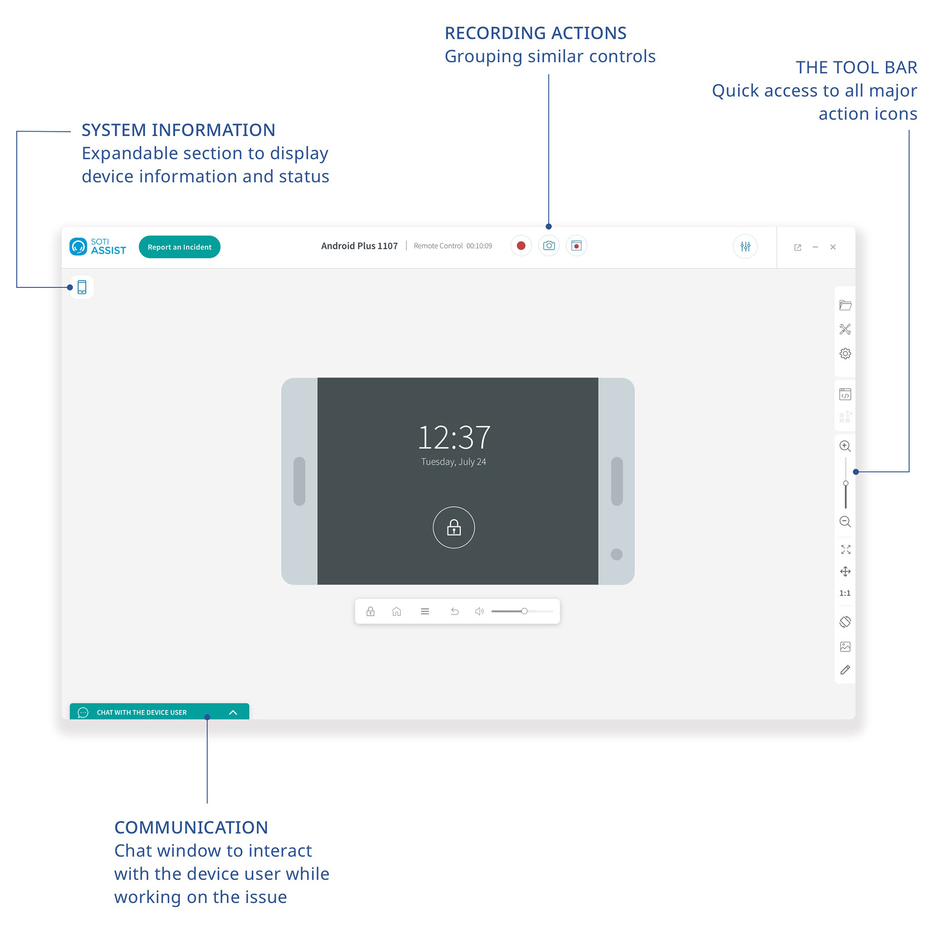
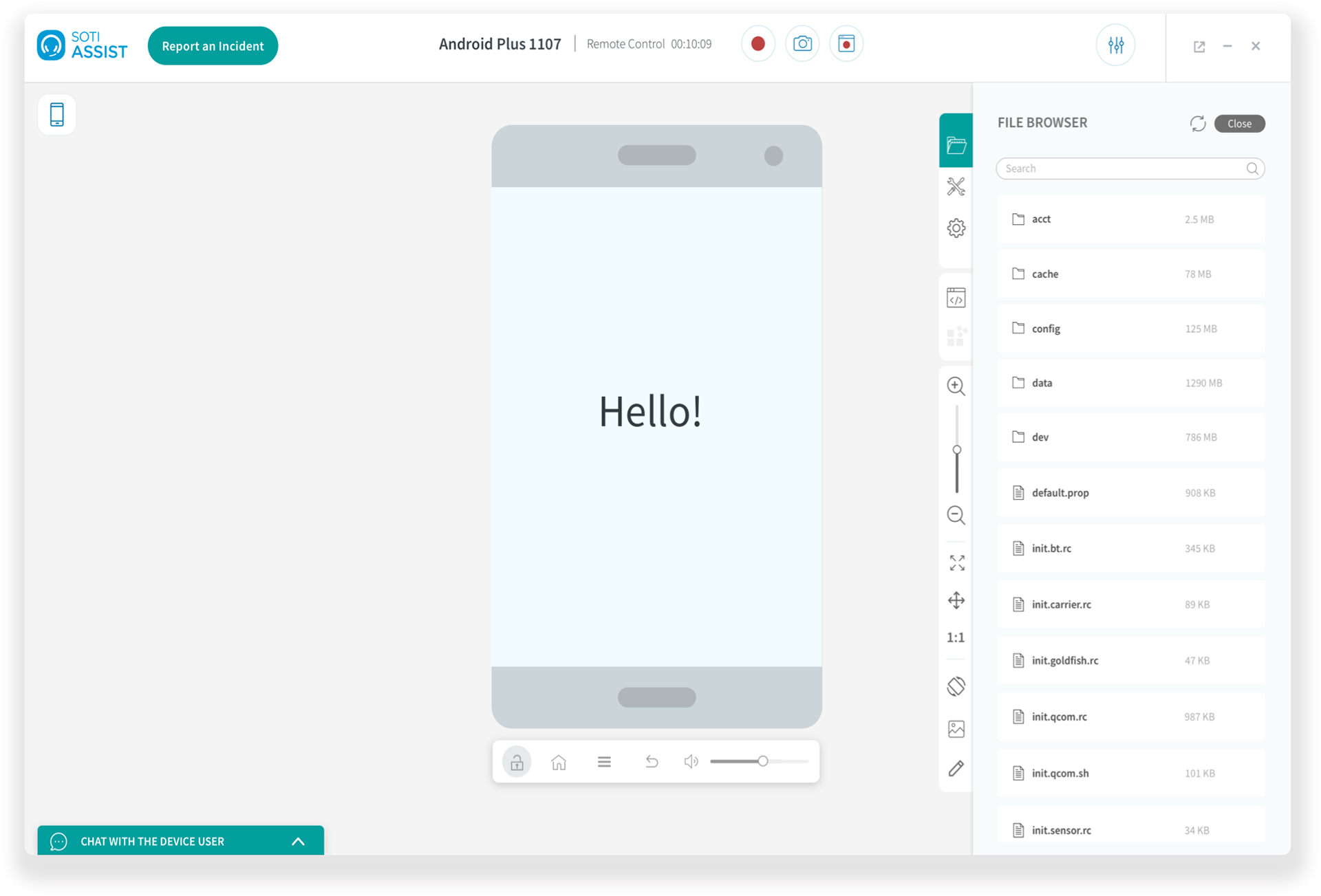
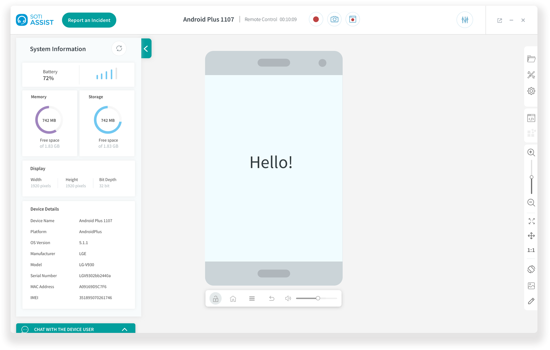
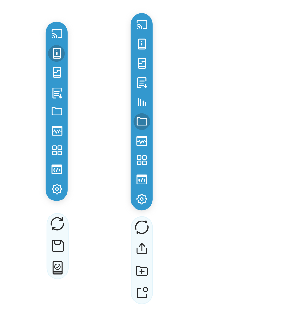
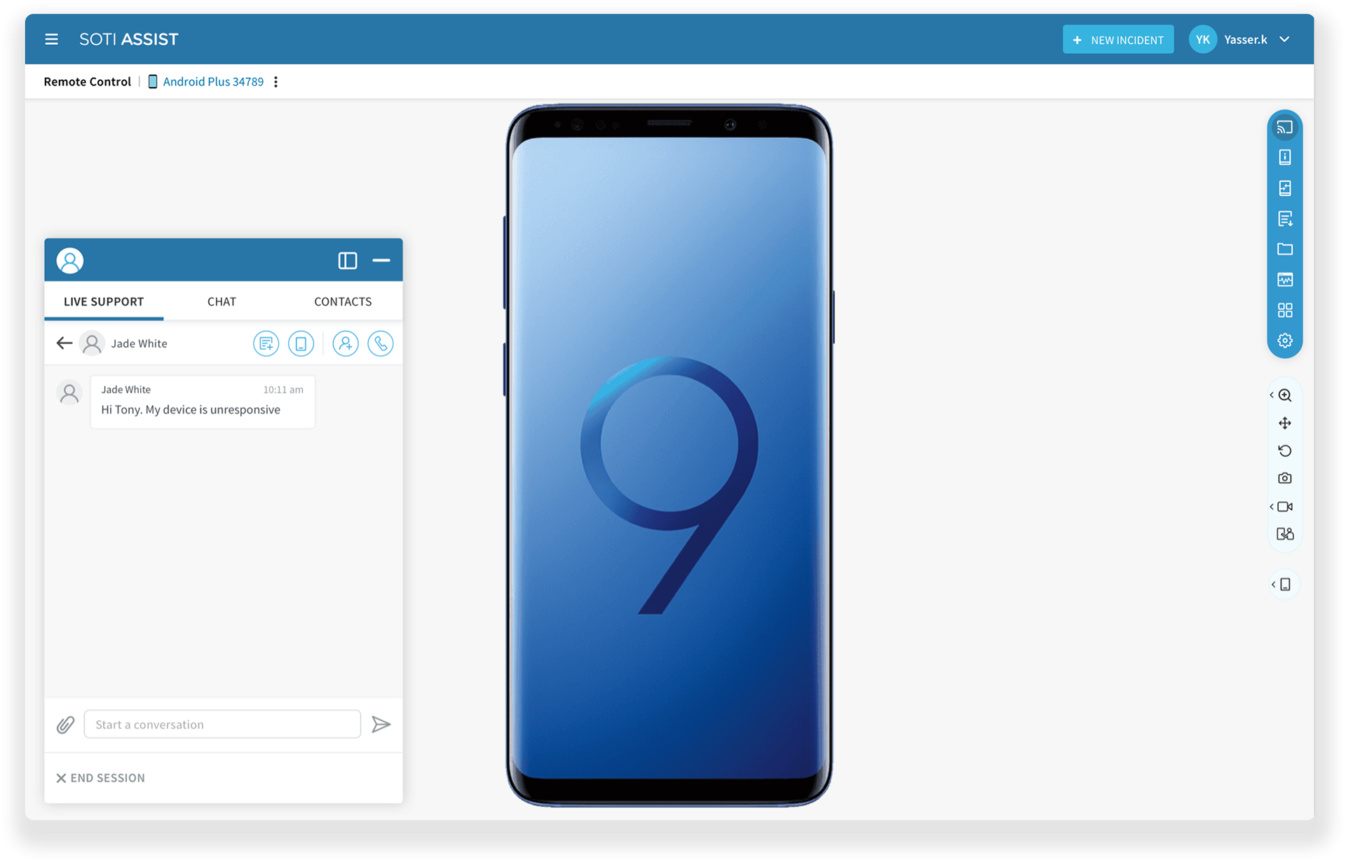
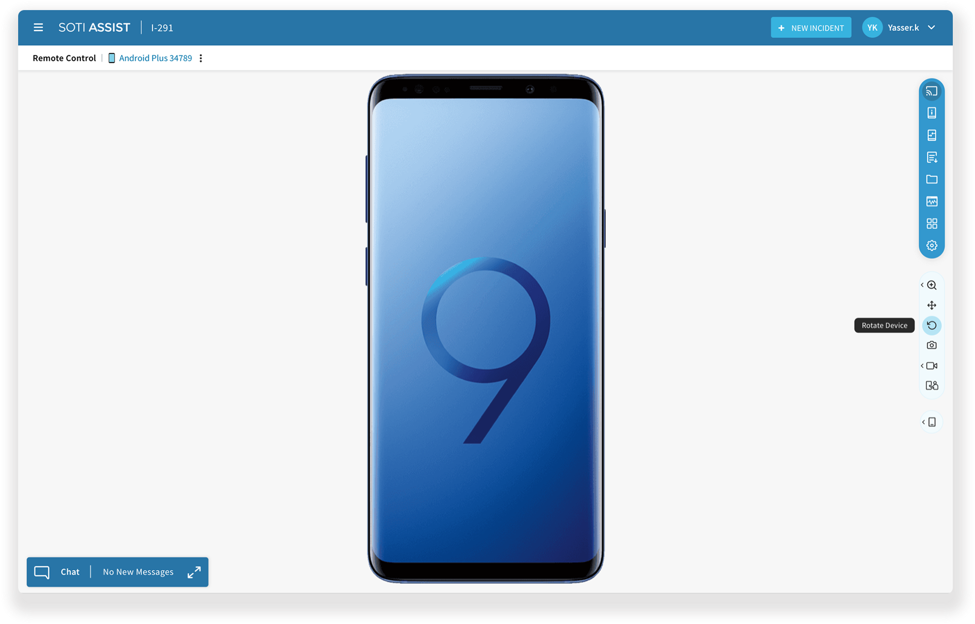
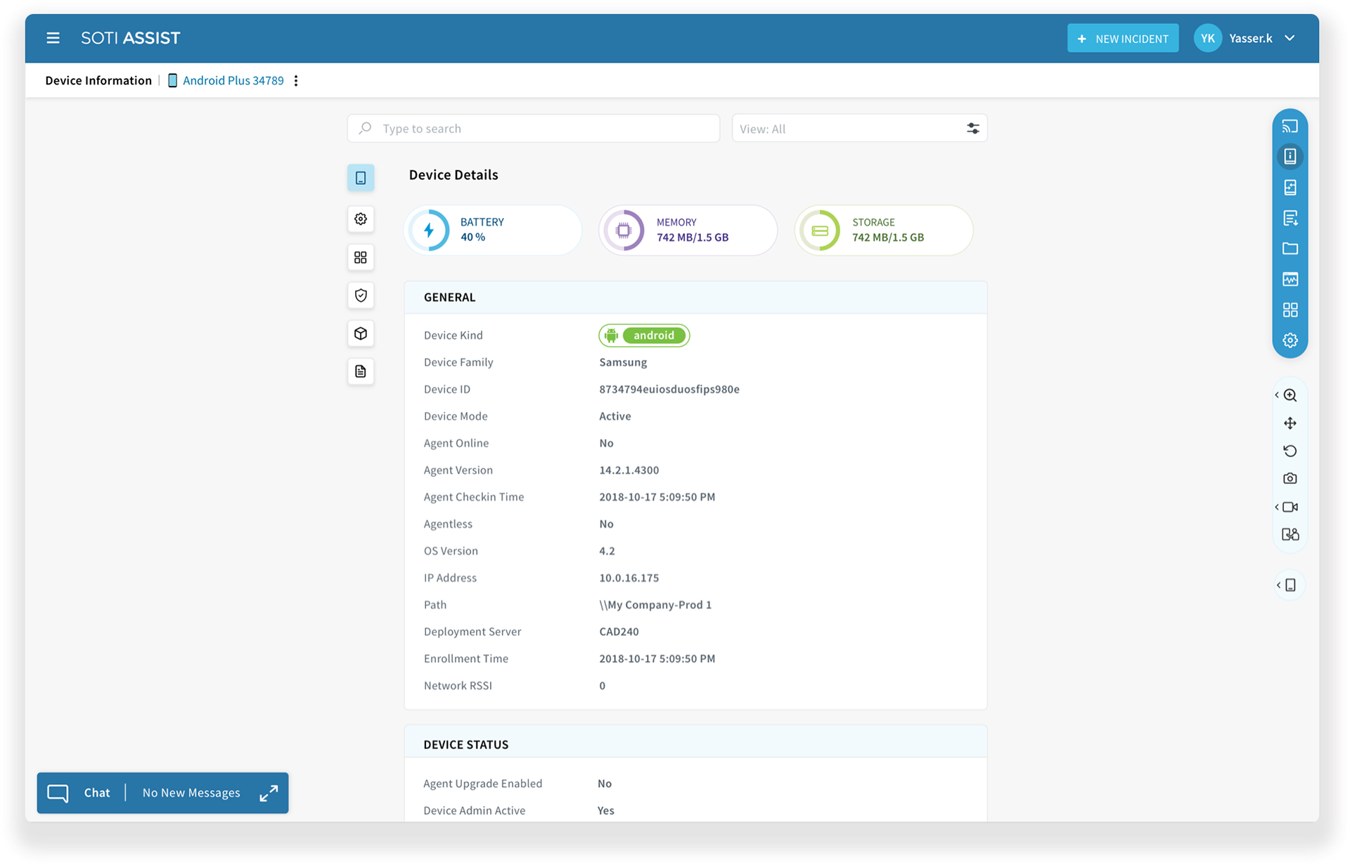
The Revolutionary Tool Bar
The introduction of the toolbar marked a revolutionary shift in how users interacted with the product. I devised a dual toolbar system consisting of a master toolbar and a secondary toolbar.
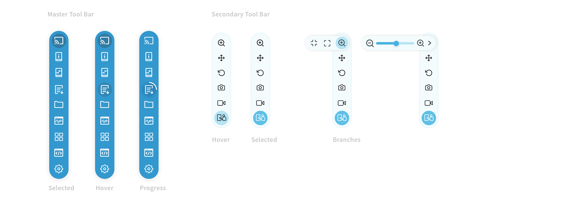
Dynamic Behaviour
This innovative approach ensures that action icons dynamically appear on the secondary toolbar based on the option selected in the master toolbar, optimizing the user interface for efficiency and relevance.
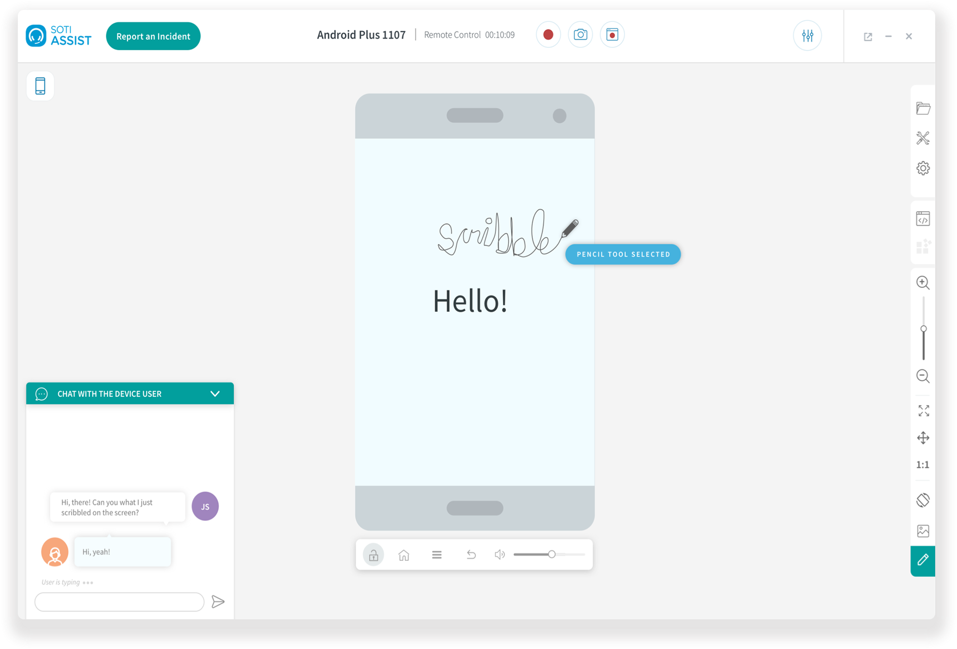
Final Design and Validation
My final design was a simple, intuitive solution that streamlined the device remote control experience making it both efficient and easy to use. Usability tests and A/B tests confirmed that users found the solution significantly easier to navigate and more efficient than the existing remote control feature.
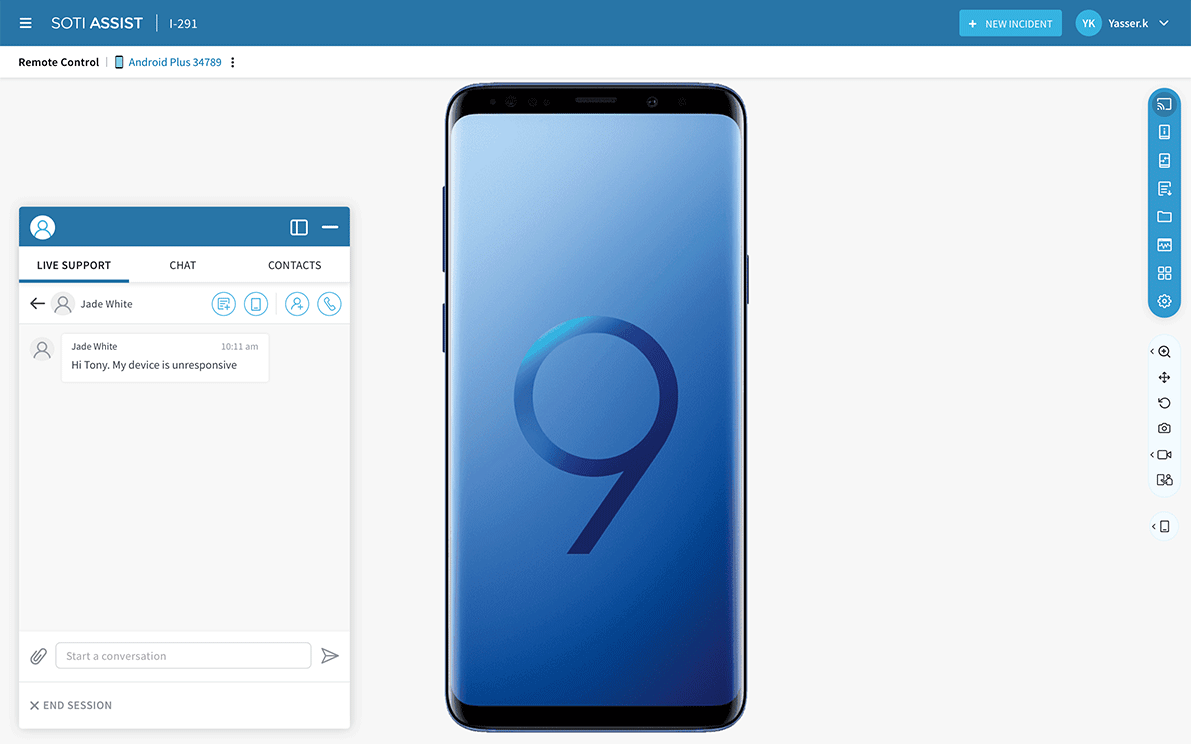
The user could now quickly access all the features through a multifunctional tool bar on the right.
I focused on creating a clean and easy-to-use workspace for support technicians, aiming to minimize the learning curve and streamline their familiarity with the system, requiring minimal effort. My solution solved the problems of scalability by categorizing similar actions and nesting them in a toolbar.
Results and TakeAway
Testing
I tested the high-fidelity prototype with our customers, they were impressed with the new design but also revealed some pain points.
The toolbar did not fit in all screen sizes. We learnt some of our customers were still using small resolution screens. Making it collapse and expand could solve this issue.
The support technicians expressed a positive response to the new design, appreciating its simplicity and straightforward navigation. While the initial version received acclaim, certain challenges and areas for improvement were identified, prompting adjustments and refinements in the subsequent version.
Takeaways
Working on this re-design project helped me identify the bigger challenges that the product had and I proposed an overall design improvement for SOTI Assist.
Recognizing the potential impact, a dedicated development team was assigned to prioritize and implement the proposed design enhancements. This marked the beginning of a substantial initiative with promising prospects.