How we utilized the design sprint to combine features of two different products and created a brand-new user experience for a diagnostic support system solution
Product Design / Team Management | 12 min read
SOTI Xsight was an initiative launched to combine two products into one and create an upgraded product that would utilize the unique features of both products. This project was about integrating a diagnostic support system - SOTI Assist, with a business intelligence tool - SOTI Insight- that would serve customers looking for a robust solution for their support system business needs.
The Problem
The existing support solution could not compete well in the market. Moreover, the product lacked clear navigation and an onboarding system which could help users perform their tasks timely and efficiently.
• The primary users - support technicians had to rely heavily on documentation to understand the product.
• The dashboard did not provide any relevant information that could help the technician speed up the resolution process.
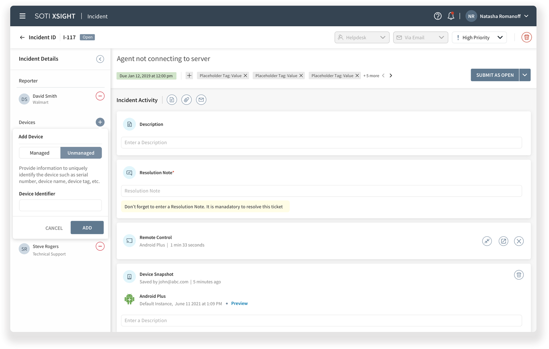
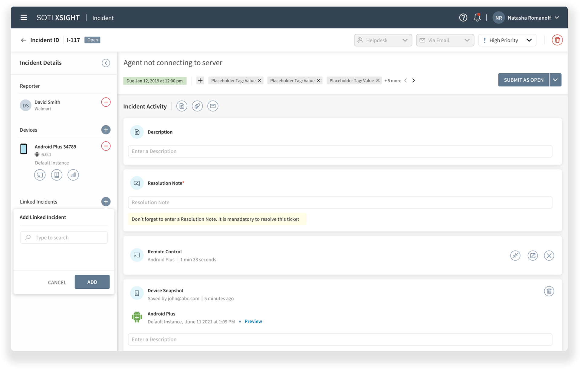
• The incident/ticket page did not have a clear call to action and the user was not given any heads-up about adding a resolution note, which was necessary to close the issue.
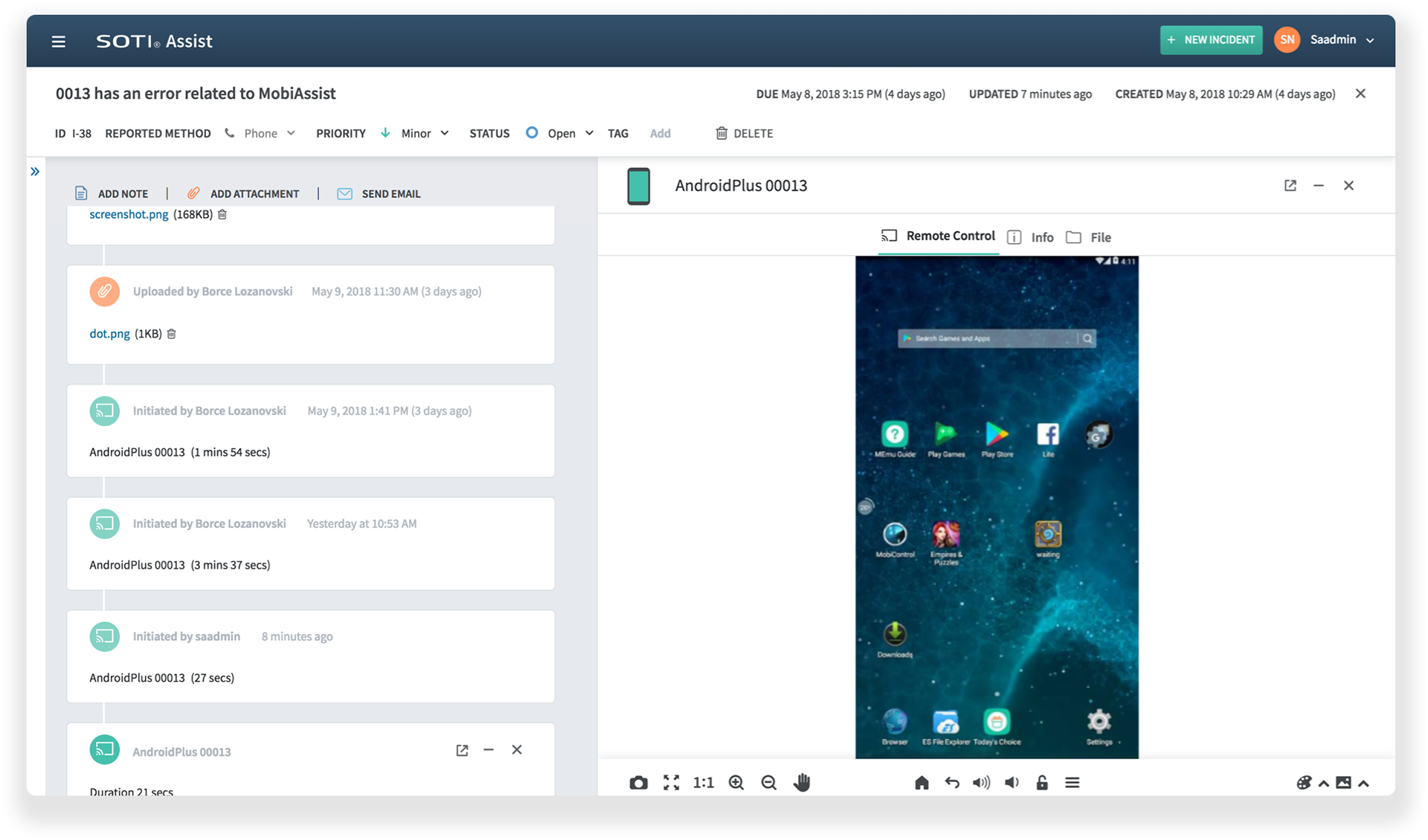
• The Remote Control feature was difficult to understand due to complex navigation and unclear controls
• Support technician could only send emails to communicate with the device user, which delayed the issue resolution process.
The original product was complex and slowed down the issue resolution process. Technicians had to take extensive training before they could start using the solution.
The Original SUPPORT SOLUTION
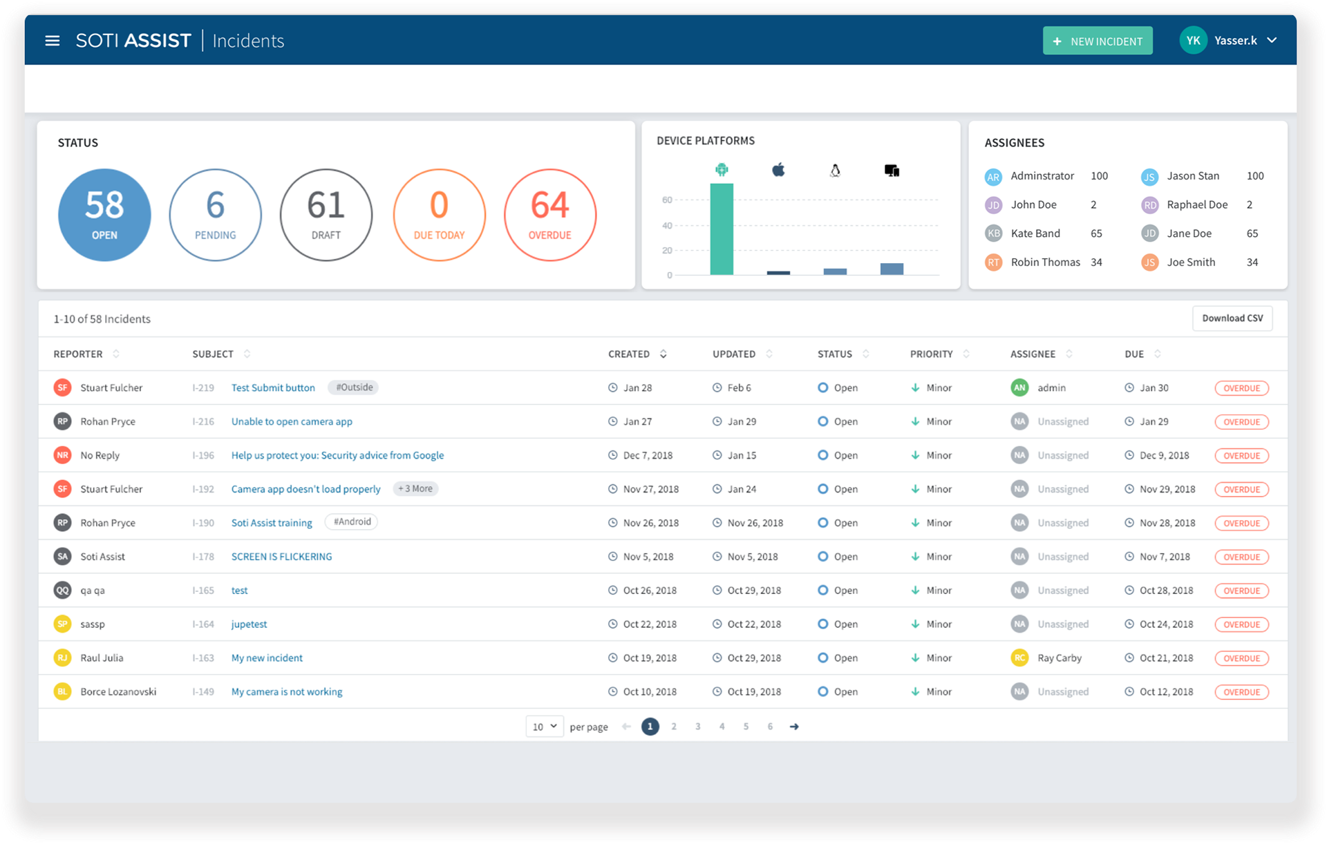
Dashboard
The Ticket Page
RESEARCH AND DISCOVERY
I interviewed the customers and key stakeholders to get an idea about the user and business needs. This phase included jumping on calls with the existing and potential users of the product and organizing meetings with stake holders to get a clear picture of major pain points and integration features.
Based on this research I was able to gather the most important user and business needs.
User Needs
1. Simple Navigation and clear controls
2. Utilize real estate to display relevant information
3. Avoid too many clicks
4. Help them resolve issues quicker
5. Minimal training for using the product
6. Ability to quickly communicate with the device user while working on the issue.
Business Needs
1. Add a device diagnostics feature to compete with the other products in the market.
2. Add a live chat feature to the product
My next step was to bring the team together to tackle this complex problem effectively. Given the complexity of the situation, a design sprint seemed the most appropriate method to address the challenge
Design Sprint
The project was complex and there was tight deadline for its initial launch, hence we chose Design Sprint methodology to accelerate the problem solving process. I took the initiative of running the design sprint along with fellow designer and UX researcher. We involved product and technical teams through out the sprint which helped us to align the team on goals, solutions, and next steps, fostering a shared understanding and commitment.
We defined our high level goal and customized the design sprint to accomodate our product needs hence decided to stretch the sprint to 4 weeks
Week 1 - Discover
Week 2 - Sketch
Week 3 - Internal review and customer interviews
Week 4 - Prototype

Discover
The discovery phase was all about gathering as much information as we could about the business requirements and pain points along with features that would make this product even better in the market. Based upon our findings in the discovery phase we mapped the major How Might We statements and started working on the solutions followed by the creation of a low-fidelity prototype ready for internal usability testing.
We observed that bringing different teams together unveiled a variety of thoughts and perspectives that significantly guided the problem-solving process. We were thrilled by the wealth of information collected, and the enjoyable part was identifying and synthesizing the most relevant points.
The most high-level HMWs included:
1. How might we make the navigation easy and simple to use?
Proposed solution - Categorize the main features of the product into different sections and provide easy access to all those major sections from the dashboard. Highlight the most important data as a call to action on main pages so that users can easily switch between relevant information sections.
2. How might we solve the problem of speed and efficiency for technicians and device users
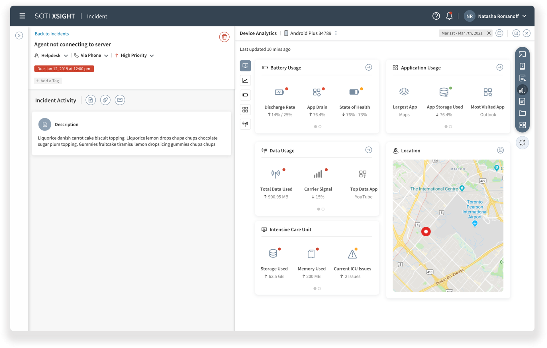
Proposed solution - Add an advanced device metrics section within the incident page so that the technician does not need to look into the device's settings for status, every time they work on an issue.
Introduce a live support system that would help device owners get quick solutions without opening a ticket for their device-related issues. This could also save time for technicians to work on major issues as most common issues could be simply resolved over a quick live chat.
3. How might we seamlessly combine features from two different products and cater to the needs of different users.
Proposed solution - Create a common customizable dashboard that highlights features from both products. These dashboards would be customized based on the logged in user, for example -
A support technician would see data related to his tasks which could include a number of open issues, level 1 issues etc.
An administrator could customize his dashboard to track the progress of all issues, assign tickets to technicians and track team progress as well.
Sketch
We worked on wireframes next to bring our proposed solutions to life.
The wireframes addressed issues related to speed, navigation and ease of use, which were voted as major pain points during the mapping phase. We created a solution for multiple users, who could now customize their dashboards according to their roles and tasks.
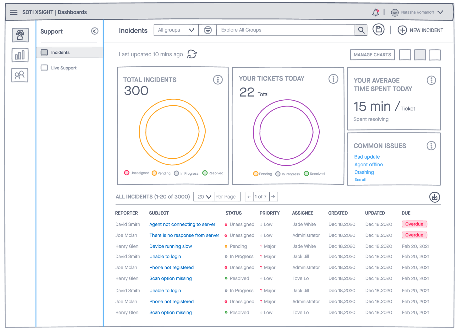
The support dashboard showing charts that provides an overall view of a technician's task and performance with an option to add or remove charts based upon their value and usability.
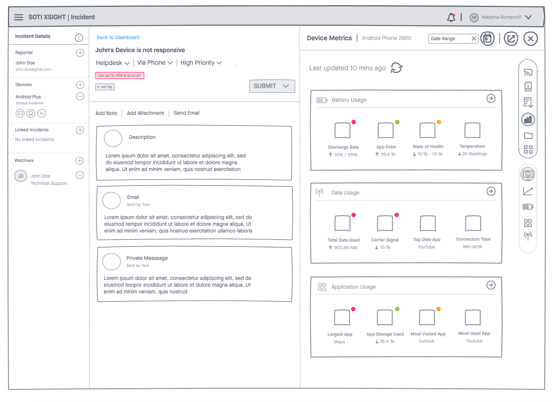
The new ticket page with clear call to actions and organized information. Also included here the most recent device metrics that could help technicians to quickly evaluate the issue


Decide
Internal reviews and customer interviews
We created a clickable prototype and organized internal review meetings. We presented our low-fidelity solution to a few chosen customers and recorded their feedback.
Overall the new solution was taken as a big improvement in the product.
The customers found the customizable dashboards extremely useful, as they could now easily assign tasks based on roles and monitor team performance.
The internal stakeholders were extremely satisfied with our approach where we combined features from two different products seamlessly into one dashboard.
Final Prototype
Once we collected feedback from internal and customer reviews, I created the high-fidelity mockups in Sketch. TO seed up the process I created components first and then utilized those to design the mockups.
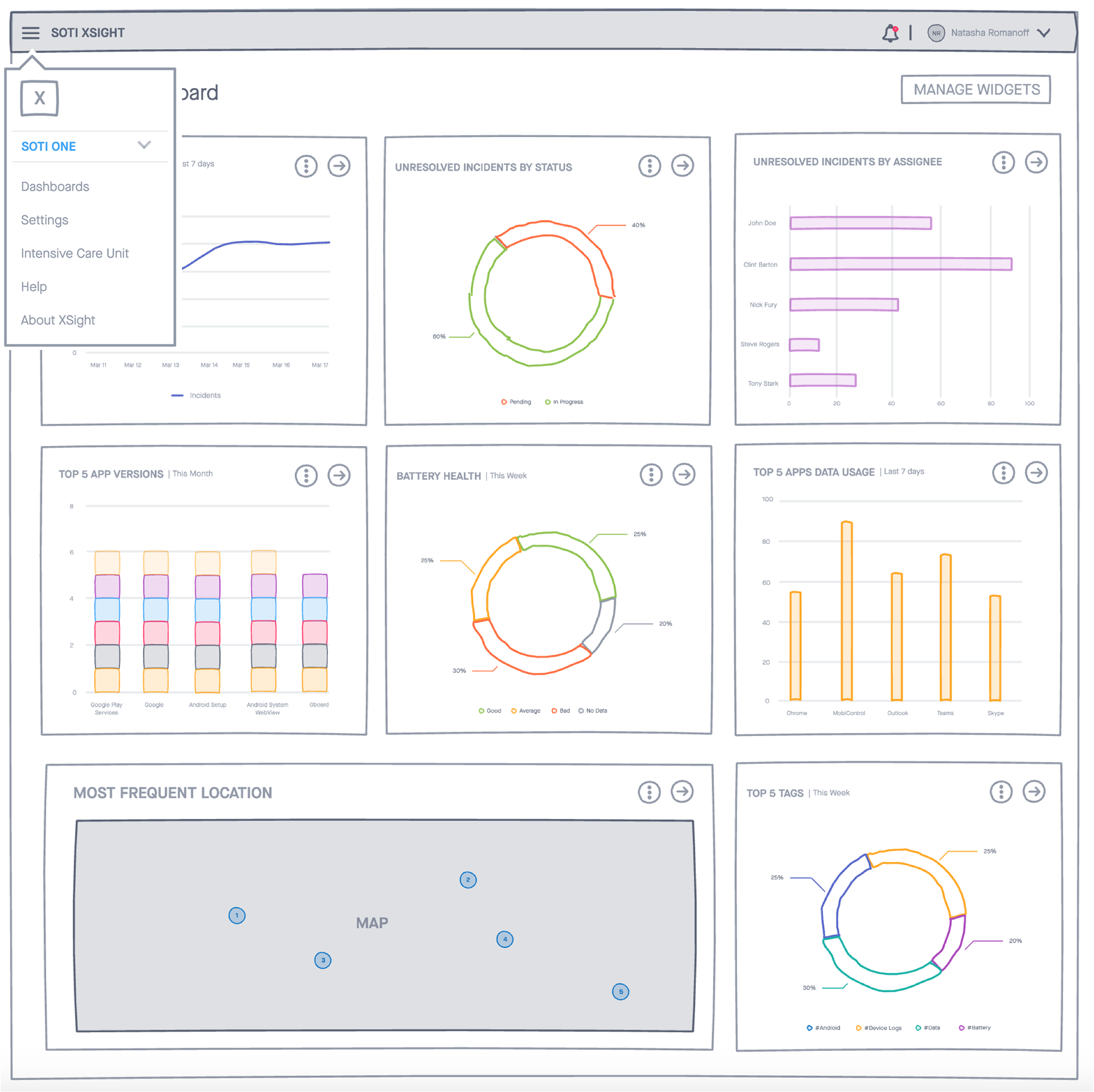
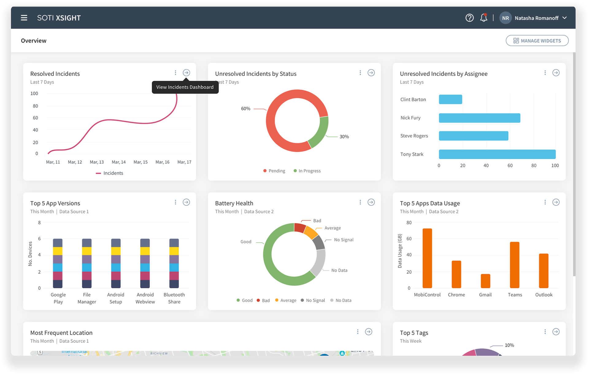
We chose a dark grey theme for the new product because most pages displayed data and charts in various colors, making the overall look more subtle and allowing users to focus on the relevant information
The colors for the charts on the dashboard were carefully selected from our style guide to avoid overwhelming users with an excessive burst of colors

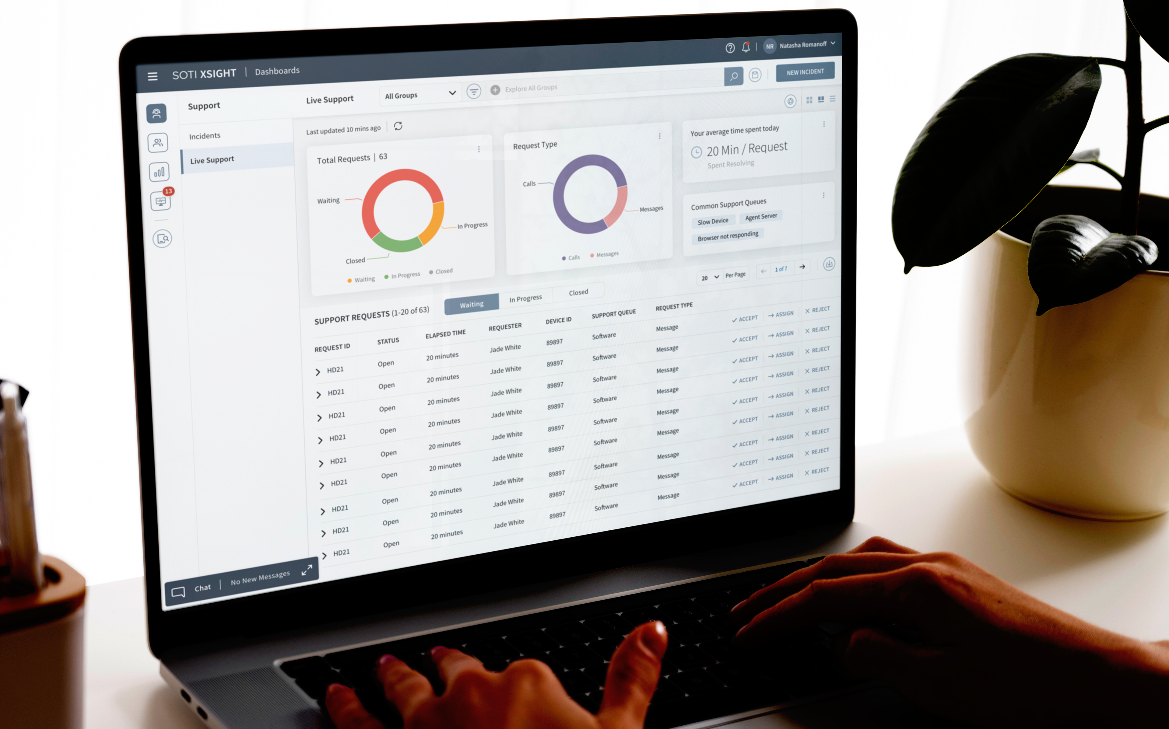
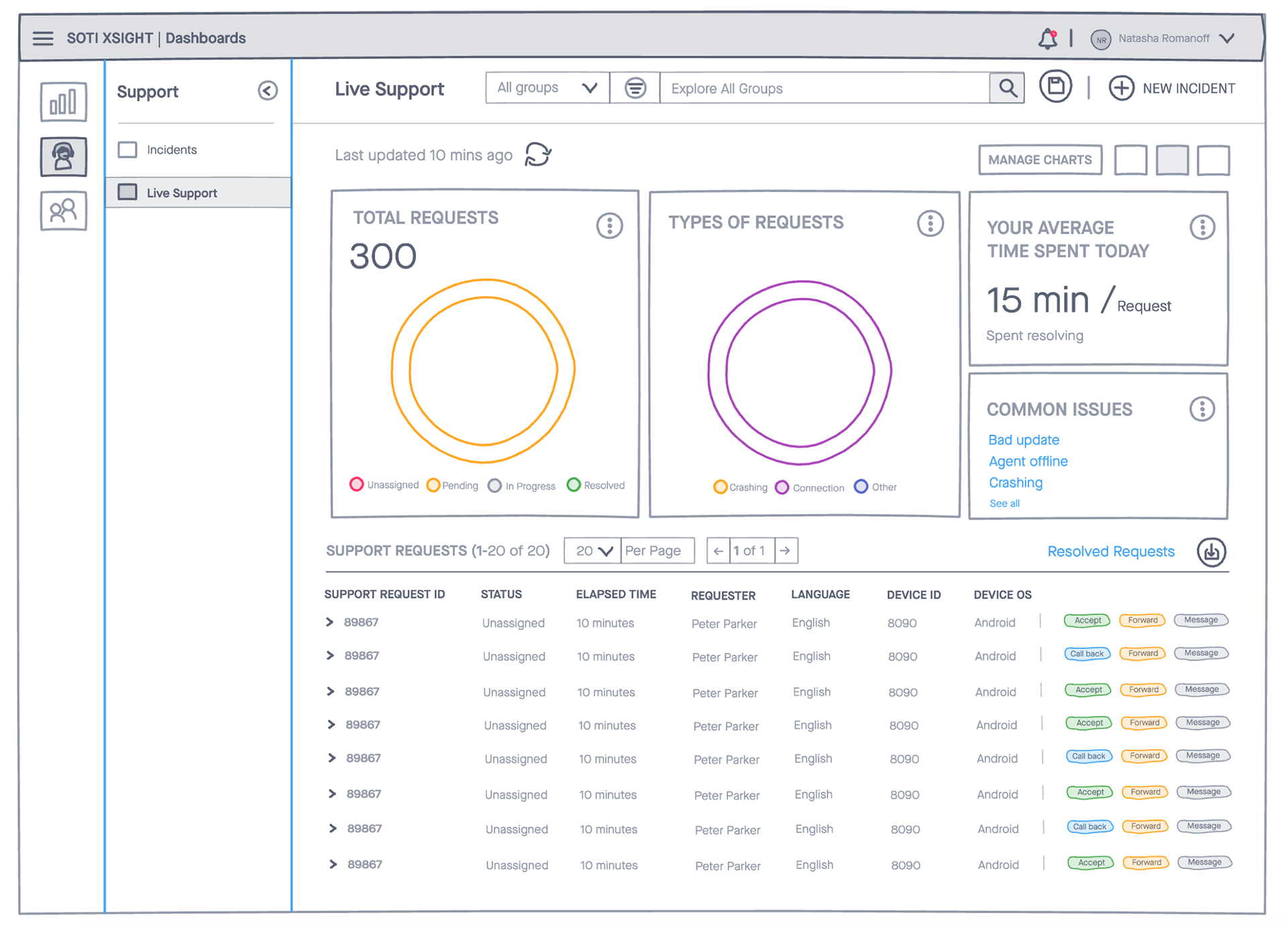
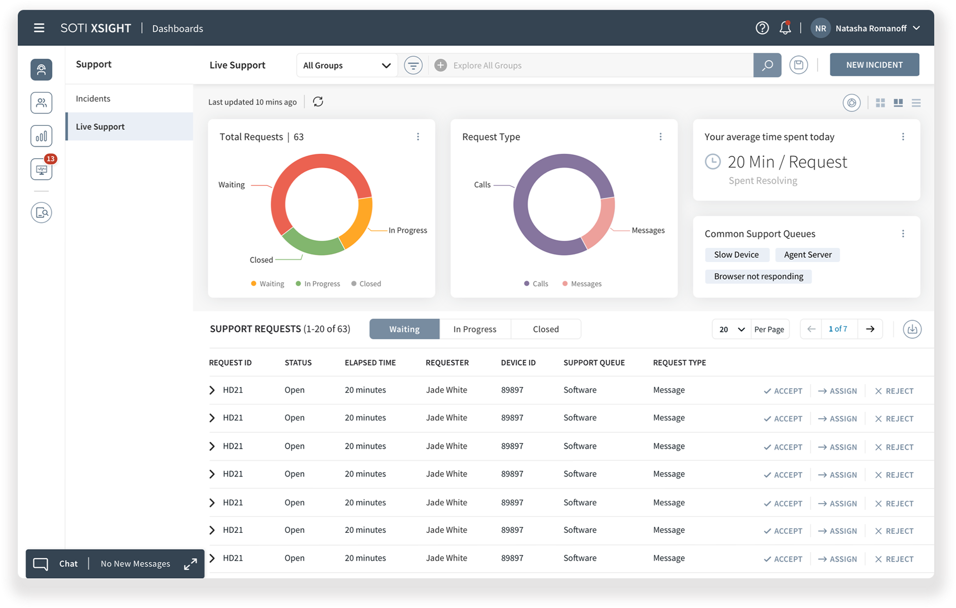
The live support dashboard clearly categorized important information, as shown in the mockup. Support requests were displayed in three different tabs, allowing technicians to quickly switch between them to view the status of requests
Important information was now displayed in the upper half of the dashboard, including the average time spent on a ticket and the most common issues. These improvements addressed the issues of speed and efficiency
One of unique features of our new design was the device analytics section, which used red, orange, and green colors to highlight device performance. This allowed technicians to quickly assess the status of battery, app usage, and data usage, helping them identify issues faster than before.


Results and Takeaways
The new product, with its simplicity and ease of use, resolved most of the usability issues identified during the research and discovery phase.
With the introduction of categorization and customization, the overall user experience improved drastically as shared by the customers.
The users did not have to depend on documentation to get familiar with the product.
Support technicians could now easily manage support tickets which enabled efficient support workflows and minimized resolution time.
The newly improved product helped retain customers who were frustrated with the existing solution and opened the door to new leads.